Expertise
Brand / Strategy / Website / UX & UI / Design / Content / Development
Channels
Digital / Print / OOH
STRAIGHTFORWARD.
Vocus was already well on their way to becoming the “most loved telco on the planet.” All they needed was a better way (and a new website) to communicate what made them so different.
THE CHALLENGE
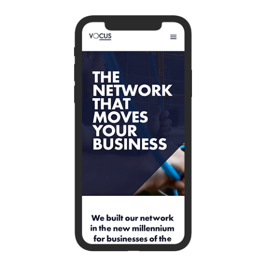
Vocus Communications, now the largest Trans-Tasman business network, came to us with a very clear brief. They needed a new website that reflected their fast growth and even faster national fibre network.
They already had a bold leader in James Spenceley, who had developed a reputation in the industry for honesty and straight-talking. This attitude was perhaps best captured in their company value of hiring ‘No Muppets!’.
This no-nonsense, quality-first approach had put Vocus well on its way to becoming an industry favourite among Australian wholesalers and ISPs. Yet they needed a better way to articulate their brand online - especially with CXO business leaders and IT managers who hadn’t heard of them, or who still didn’t understand the value of their high-performance fibre network solutions.
THE SOLUTION
Rather than jump right into design and development, we first took a few steps back, engaging the Vocus team in our collaborative Brand Foundations process to help set the tone for the brand moving forward. This included a mix of group and one-on-one interviews with key internal stakeholders and customers, along with our own research and an archetypes survey that we distributed among their staff.
As we wrote our report and workshopped our findings, it became clear that this was not your traditional telco. Instead, Vocus was the archetypal “Maverick,” a nonconformist, customer-focused brand that is happy to challenge the incumbents, and make firm commitments about how and why it can deliver its services better than anyone else in the industry.
Our studio took this archetype to heart when it developed the new brand concept: STRAIGHTFORWARD. From the cheeky yet confident tone of the copy to the fibre-based blue colours and simple, spliced graphical device, we attempted to mimic their transparent, straight-shooting way of doing business.
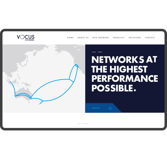
We also worked with them to get the details right from every point of presence on their Mapbox-fueled network map to the header imagery on each product page.
The Results
Vocus launched their new Australian website just as they accomplished another major feat - acquiring Perth-based communications provider Amcom and hitting their $1 billion valuation goal three years early.
Not long after that, we worked with them to launch their New Zealand website, which showcased their collaborative, Kiwi qualities and a number of country-specific offerings.
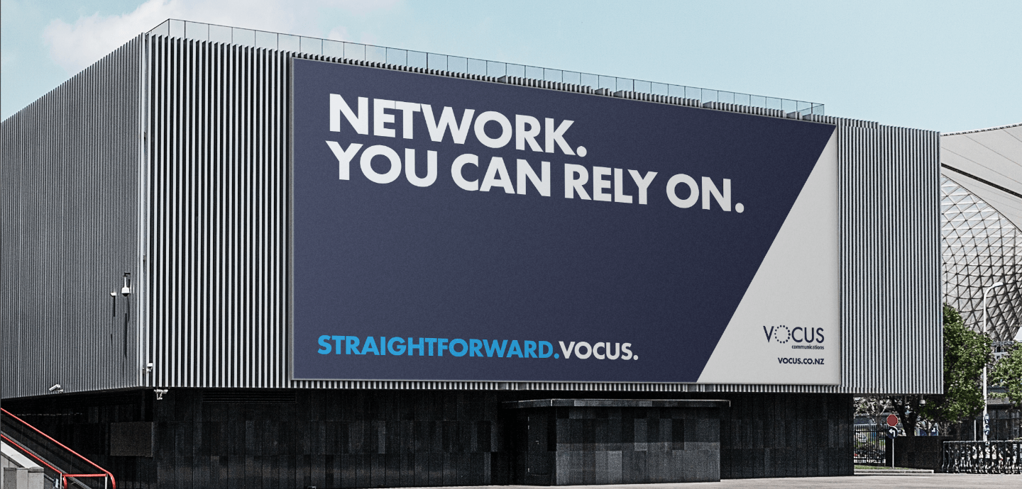
Bang specialises in bringing the brand character and personality through to every brand touchpoint. So since then, we’ve also helped them to extend their new “straightforward” mantra across their business with additional projects like a new logo lock up, business cards and Office templates, and an out-of-home (think: giant billboards) media campaign in New Zealand.

TINA DEKLERK, MARKETING Manager, VocusThe Bang team are awesome! We love working with their account managers, and we're really happy with all the brand work they've done for us so far. We'll continue working with them not only because they understand our brand and our values so well, but also because we've truly enjoyed the experience from the beginning to the end of each project.
Expertise
Strategy / Website / UX & UI / Design / Content / Development
Channels
Digital / Social